
By Colin Blackwell and his AI Assistants
The Phoenix Suns don’t just use Instagram infographics to highlight player stats, they also spotlight their community and CSR efforts. This week, I’m analyzing two of their recent visuals to see how well it communicates the impact behind the numbers and where there’s room for deeper storytelling.
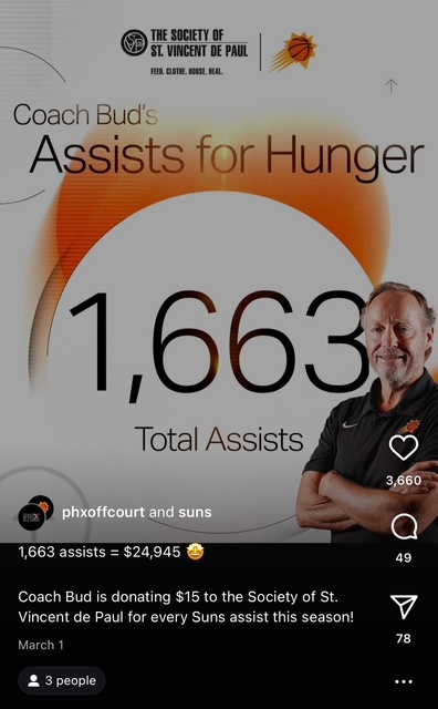
The “Assists for Hunger” graphic featuring Mike Budenholzer and the Phoenix Suns offers a clean, visually appealing presentation. It clearly communicates the basics: the Suns have totaled 1,663 assists, equating to a $24,945 donation to The Society of St. Vincent de Paul. The bold, centered typography and minimalistic layout make it instantly readable, even when quickly scrolling through a social feed. The visual simplicity is a strength, there’s no clutter, and the message is easy to grasp.
However, the graphic falls short in storytelling and emotional engagement. While we see the impressive total and know the money goes to a charity, there’s very little context provided about the impact. What does St. Vincent de Paul do specifically with this funding? Is there anyway we could get more from former coach Budenholzer than a basic pose that feels edited on and unattached? The graphic misses an opportunity to deepen viewer understanding by highlighting what the donations tangibly support.
In addition, there is no direct call-to-action or link to learn more about the organization or the campaign. A small caption or QR code could have added tremendous value by bridging the gap between awareness and action. Even a one-line description about St. Vincent de Paul’s target beneficiaries would give the audience a stronger emotional connection.
Another graphic they used was for highlighting their Junior Mercury program, where they team up with the WNBA franchise to give young girls the opportunity to play in youth leagues at their local YMCA’s.

This post stands out by placing the focus squarely on the child, which is fitting for a piece centered on youth basketball. This human element helps build an emotional connection, making the graphic more than just a collection of statistics. The numbers themselves aren’t the dominant visual, but they are presented clearly and are easy to interpret. The steady progression from winter to spring participation adds a narrative arc that helps the viewer understand the impact of the program over time. The design also does a nice job of using color and imagery that ties into the Suns and Mercury branding without becoming overwhelming or distracting.
What sets this graphic apart is its ability to tell a fuller story compared to more data-heavy alternatives. It feels purposeful and engaging rather than just informative. However, there is still room for improvement. While the numbers are simple to understand, they could be presented in a more dynamic way—such as through a bar chart or timeline—to visually emphasize the growth pattern and create a stronger visual rhythm. Adding a graphical element to show the linear increase would elevate the post, making it not only emotionally resonant but also visually compelling.